
MANON PELLISSIER
Designer d'espace
 |  |
|---|---|
 |  |
 |  |
 |  |
 |
MERCURE HÔTEL
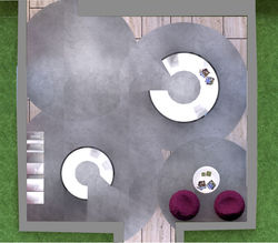
Les enjeux d'un aménagement pour une enseigne résident dans le respect de l'identité de cette dernière.
Dans ce projet, l'identité de la chaîne Mercure Hôtel guide l'intégralité du programme demandé : réaménager une entrée secondaire, un espace bar lounge et une terrasse en continuité.
D'une part, la prédominance du violet, couleur de l'enseigne, est présente dans l'ensemble des 3 espaces. D'autre part, le respect de la devise de l'enseigne "in harmony with people and places", se traduit par la reprise des éléments déjà présent dans l'hôtel à savoir la pierre brute, l'intimité, le charme.
MERCURE HOTEL
The stakes of a development for a sign reside in respect of the identity of the latter.
In this project, the identity of the Mercure Hotel chain guides the entire requested program: redevelop a secondary entrance, a lounge bar area and a terrace in continuity.
On the one hand, the predominance of purple, the color of the sign, is present in all 3 spaces. On the other hand, the respect of the motto of the sign "in harmony with people and places", results in the recovery of the elements already present in the hotel to know the rough stone, the intimacy, the charm.